 | Features Map Type and GIS |
a single symbol map |
Multiple symbol map |
you can associate different symbols for a value or range of values for each point of data |
A unique values map based onattribute field "State name"a Shaded Area Map to display your sale data. You can use graduated color |
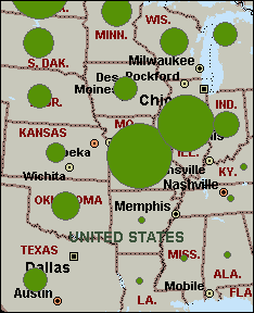
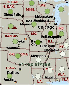
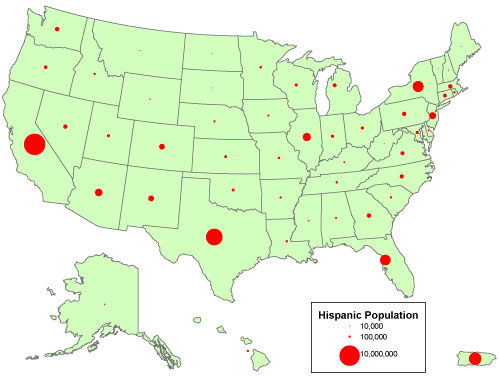
Graduated Symbols: In a Sized Circle Map, your data is represented by circles of varying size on the map. The larger the circle at a given location, the higher the value represented |
Shaded Circle Map |
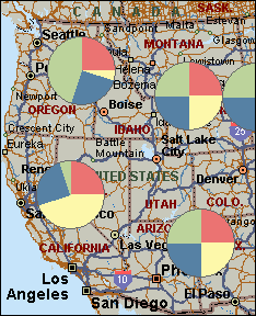
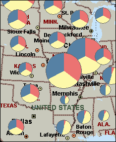
When you use a Pie Chart Map to display your data, you can map up to sixteen numerical data fields to each location of data |
When you use a Sized Pie Chart Map to display your data, you can map up to sixteen numerical data fields to each location of data |
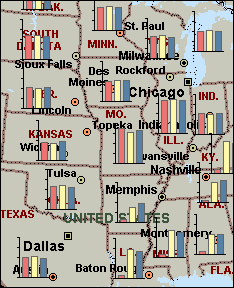
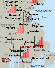
When you use a Column Chart Map to display your data, you can map up to sixteen numerical data fields to each location of data |
When you use a Series Column Chart Map to display your data, you can map up to sixteen numerical data fields to each location of data |
Dot Density |
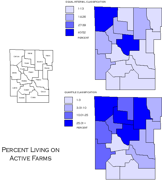
Equal interval classification |
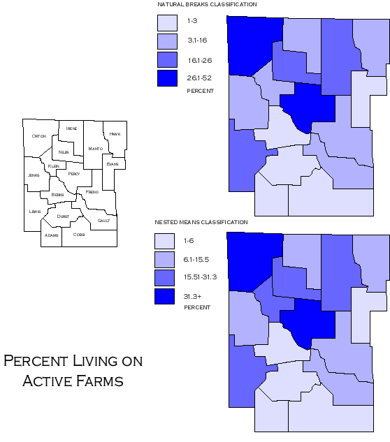
Natural Breack Classification |
Comparing Equal Interval and Quantile Classifications -http://www.ncgia.ucsb.edu/cctp/units/unit47/html/quanteq.html |
Comparing Natural Breaks and Nested Means Classifications - http://www.ncgia.ucsb.edu/cctp/units/unit47/html/nat_brks.html |
Chart map proportional to the sum of categories |
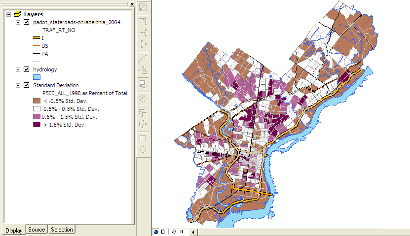
Standard Deviation Classification |
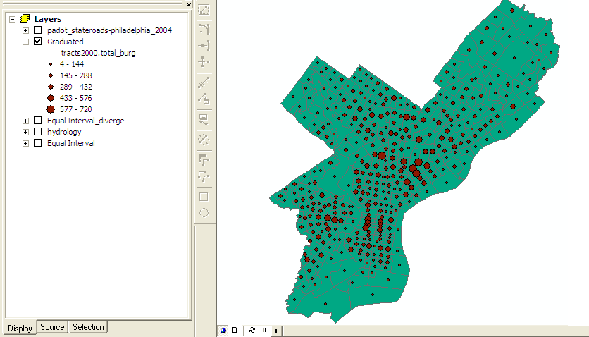
Graduated |
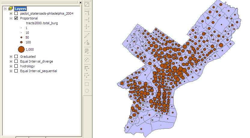
Proportional |
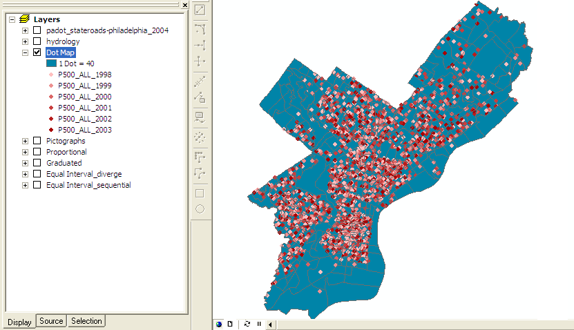
Dot Map |
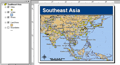

About data map types
It is important to choose the most appropriate map type to display your data on the map. Each one of the nine map types can display information in a different way. Deciding which map type you should use depends on the type of data and the message you want the data to convey.
There are three general types of maps:
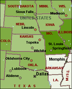
A map that displays locations without any associated numerical data. You should use one of the following maps for this type of data.
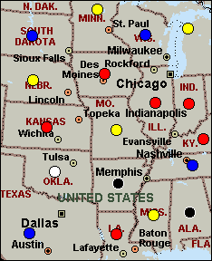
Pushpin Map
When you use a Pushpin Map to display your data, individual data points are represented as Pushpins on the map. Unlike Multiple Symbol Maps, Pushpin Maps display all the data points with a single symbol.
For example, this map was created with data from the MapPoint Tutorial and shows company locations. Each company is represented as a single Pushpin on the map.
SINGLE SYMBOL - all features are drawn with the same symbol.
CATEGORIES MAP TYPE: UNIQUE VALUES
Different color is used to characterize unique value in an attribute. Unique values are good for three types of attributes:
- Attributes that descrube the name, type, condition, or a cathegory of a feature
- Attributes that contain measurements or quantities already classified
- Attributes that uniquelly identify features
GROUPING CLASSES IN A LEGEND
Layer Properties - Symbology - Categories-Unique Value - specify the Value - click Add all values- Select the classes to be grouped- Group values (for ex. State Name)
QUANTITIES MAP TYPE for numeretic or quantitative, attribute data, such as population, acreage, temperatures, precipitation or river discharge... There are 4 methods:graduated color, graduated symbol, proportional symbol, and dot densit and it depended from ordinal, interval, ratio, or cyclic data.
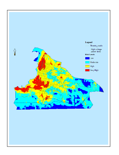
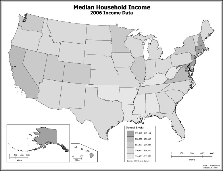
Graduated Color - colors change according to the values of a particular attribute, using a color ramp, with darker color representing higher numeric values. Most useful for showing data that is ranked or has a numerical progression.
Graduated Symbols ¢ similar to graduated color map, except the variation is in the size of a point symbol, or the width of a line symbol. Values are grouped into a few (5 or 6) discrete classes. Most useful for showing rank or progression.
Proportional Symbols ¢ Similar to the graduated symbol map, except that the symbol for each state is drawn proportional in size to the population value, instead of dividing states into discrete classes. In place of just a few (5-6 symbols), a continuous range of symbol sizes are used, from the smallest to the largest.
Dot Density ¢ Symbolizes polygon features using dots inside the polygons to represent an attribute value. Each dot represents a specific value. Used for communicating density of occurrences of a feature in addition to the quantity. These types of map can be misleading, however, becayse the human eye naturally infers pattern, even if none exists.
Classification Using Numerical Values
A classification is a process that groups similar features based on a particular attribute value into a smaller set of groups or classes by assigning the same symbols to each member of the class. ArcMap offers a number five standard methods of classification: defined interval, equal interval, natural breaks, quintiles, and standard deviation. A sixth classification, manual, allows class limits to be adjusted to create your own classification.
Equal Interval ¢ this method divides the full range of attribute values into equal sub-ranges. The features are then classified based on those sub-ranges. Closely related to equal interval is defined interval, which divides the full range of attribute values into equally sized sub-ranges based on a specified interval size. Instead of specifying the number of classes and calculating the intervals (as an equal interval), the interval is set and the number of classes is calculated.
Natural Breaks Method locates breakpoints between classes to form groups that are internally homogeneous, while maintaining a distinct heterogeneity between the groups. Jenks optimization, the default classification, is the algorithm used to minimize the variance within each of the classes. While Natural Breaks shows patterns, it is not recommended for comparing maps with similar, but different data.
The Quintiles Method creates classes with the same number of features in each class. An appropriate descriptive statistic to evaluate dispersion among attribute values ranked on an ordinal scale is a quintile range as the distribution is divided into equal segments.
The Standard Deviation Method calculates the mean value of selected attributes and creates classes above and below the mean. In normal distribution, values near the arithmetic mean are expected to occur most often. The greater the deviation from the mean, the less often that value is expected to occur. The standard deviation then is a way of describing the dispersion of values around the mean of a normal distribution.
Normalizing Data in 2 ways. The first process divides each value by the total of all the values in the column, giving a percentage. The second process divides the population values by another field, such as total area of a state and shows population density per state.
Quantiles. This method classifies data into a certain number of categories with an equal number of units in each category.
Equal Intervals. This method sets the value ranges in each category equal in size. The entire range of data values (max - min) is divided equally into however many categories have been chosen
Data classification II - http://www.ncgia.ucsb.edu/cctp/units/unit47/html/mas_class.html
In general, the classification method chosen should accomplish two things:
1. maximize the between-class differences
2. minimize the within-class differences<> In some case, quantile and equal interval methods meet these criteria, but often the arbitrary nature of these methods is inferior to those mentioned here.
The most straightforward way of accomplishing the criteria above is to input the class breaks manually after careful study of the data. For ordered data, this is done by sorting the data from lowest value to highest, as done with the "percent living on active farms" data, and looking for large gaps, or natural breaks. It is here that the class breaks should be placed in order to meet the two criteria above. Some advanced GIS packages will do this procedure for you automatically, using a technique called Jenks Optimization, which will iteratively calculate best classification strategy.
One other technique worth noting is nested means classification. In this method, the mathematical mean of the attribute values, ā▌, is calculated and a class break is placed at ā▌. This separates the data into two classes -- those values above and those values below the mean. Data is further classified by calculating the means of the values within these two categories, and inserting class breaks at each of those two points. This leaves four classes, the breaks for which have been determined not arbitrarily but by methods specific to the data set and its characteristics. One more level of means may be calculated, leaving eight classes. This nested means method is mathematically straightforward and can be a good compromise for skewed data.
Natural Breaks Classification
It is a manual data classification method that divides data into classes based on the natural groups in the data distribution. It uses a statistical formula (JenkĪ”s optimization) that calculates groupings of data values based on data distribution, and also seeks to reduce variance within groups and maximize variance between groups- http://en.wikipedia.org/wiki/Variance.
This method is based on subjective decision and it is best choice for combining similar values. Since the class ranges are specific to individual dataset, it is difficult to compare a map with another map and to choose the optimum number of classes especially if the data is evenly distributed.
Quantile classification method distributes a set of values into groups that contain an equal number of values. This method places the same number of data values in each class and will never have empty classes or classes with too few or too many values. It is attractive in that this method always produces distinct map patterns- http://en.wikipedia.org/wiki/Quantile.
Equal Interval Classification method divides a set of attribute values into groups that contain an equal range of values. This method better communicates with continuous set of data. The map designed by using equal interval classification is easy to accomplish and read . It however is not good for clustered data because you might get the map with many features in one or two classes and some classes with no features because of clustered data.
Standard deviation classification method finds the mean value, and then places class breaks above and below the mean at intervals of either 0.25, 0.5 or, one standard deviation until all the data values are contained within the classes. Values that are beyond the three standard deviations from the mean are aggregated into two classes; greater than three standard deviation above the mean and less than three standard deviation below the mean - http://en.wikipedia.org/wiki/Mean, http://en.wikipedia.org/wiki/Standard_deviation
The table below describes some uses for each map type.
Map Type Recommended to
Shaded Area Compare a single numerical data field for larger areas such as states, counties, and ZIP Codes. This type of map is also useful for displaying non-numerical data associated with large areas.
Shaded Circle Compare a single numerical data field at points such as cities and specific addresses. This type of map is useful for data that contains many records, because shaded circles may prevent overlapping and make your map easier to read. You can also use this map type to represent a second set of data on a Shaded Area Map.
Sized Circle Compare a single numerical data field for concentrated areas such as addresses, cities, and points. This map type is useful to quickly compare data from one location to another.
Multiple Symbol Display a single data field at points such as cities and specific addresses. You may want to use this map type to assign a different symbol for each range or value of data.
Pie Chart Compare records with more than one field of numerical data per location. This map type is useful if you want display values that have been sub-divided.
Sized Pie Chart Compare records with more than one field of numerical data per location. This map type is similar to the Pie Chart but the size of the pies is determined by the sum of the data fields. This type of map is useful when you want to compare the sum of sub-divided data values from one location to another.
Column Chart Compare records with more than one field of numerical data per location. This type of map is useful for displaying data comparing different groups of information, as well as data containing negative numbers.
Series Column Chart Compare records with more than one field of numerical data per location. This type of map is useful for displaying a series of data. You can use a Series Column Chart map to display numerical data that has changed over time.
Pushpin Display a location on the map. This type of map is useful for mapping addresses and for displaying
About using a single symbol to draw features
About Data Map Types
Data Classification (comparing)
Choroplet maps
Data Classification