 | Working with Layers |
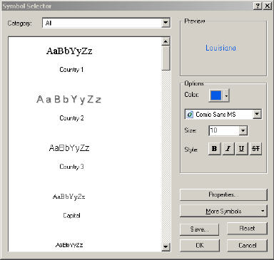
Properties-Symbol Selector for Text and Graphics (Layer Properties-Label under "text Symbols" click on "Symbol" |
|
texture |
Displaying quantities using a classification scheme |
Displaying quantities using a classification scheme - result |
Displaying categorical data using unique symbols |
Combining quantities and categories using chart mapping |
Chart |
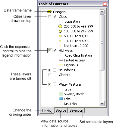
Layers in the table of contents - http://webhelp.esri.com/arcgisdesktop/9.2/index.cfm?TopicName=Using_the_table_of_contents |
Select symbols (extra symbols) - http://webhelp.esri.com/arcgisexplorer/900/en/select_symbols.htm - The Symbol Gallery displays the list of symbols available for the type of GIS feature that you are symbolizing |
Creating text from layers - http://webhelp.esri.com/arcgisdesktop/9.2/index.cfm?TopicName=Text |
Grouping layers |
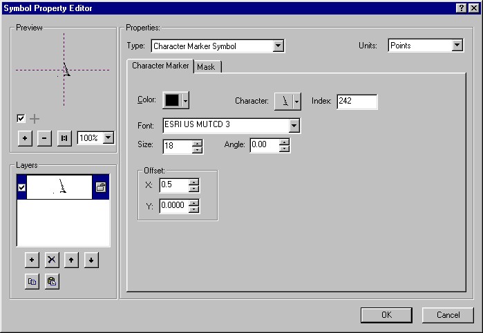
Symbol Property Editor |
Attribute table selecting options - select by attributes - brings up a query builder. Use unique value. Apply. Make the map document active- selected records are blue.D new layer from selected features (Table of Contents - Selection - Create Layer From Selected Features)
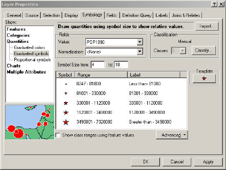
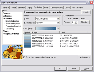
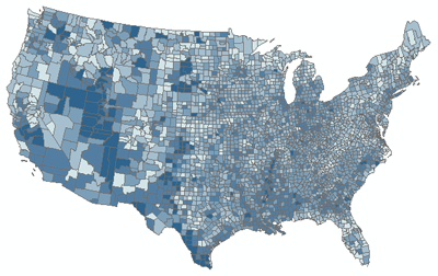
Displaying quantities using a classification scheme
Many numerical attribute values can reflect a range of measurementsŚfor example, population density, percentages, measures of rainfall, and so on. Such values can be classified into ranges of values, and each class be assigned a map symbol for display purposes. You can choose to symbolize quantities with graduated colors or symbols, proportional symbols, or using dots. When you specify the attribute value to use, a default classification is assigned. You can modify the classification scheme, the number of ranges, and the class breaks.
Once you have classified your data, you can use various rendering methods to depict the classes in your map. The example below shows a choropleth map of population density (percentage of the population under age five, by US county), drawn using graduated colors. Once you pick the renderer, you can choose a color ramp from the drop-down menu, or specify the color of an individual class by double-clicking it to display the Symbol Selector dialog box.
About using a single symbol to draw features
Often, seeing where something isŚand where it isn''tŚcan tell you exactly what you need to know. Mapping the location of features reveals patterns and trends that can help you make better decisions. For example, a business owner might map where his customers live to help decide where to target his advertising.
The easiest way to see where features are is to draw them using a single symbol. You can draw any type of data this way. When you create a new layer, ArcMap draws it by default with a single symbol.
On a map that uses a single symbol to represent cities, you could easily see where people live and conclude that some areas are more densely populated based on the number of cities clustered together
How to draw a layer using a single symbol
Right-click the layer you want to draw with a single symbol in the table of contents and click Properties.
Click the Symbology tab.
Click Features in the Show box on the left side of the dialog box.
Because Single symbol is the only option under the Features renderer, ArcMap automatically selects it.
Click the Symbol button to change the symbol.
Click a new symbol or change specific properties of the symbol in the Symbol Selector dialog box.
Click OK on the Symbol Selector dialog box.
Type a Label for the feature.
The label appears next to the symbol in the table of contents.
Click OK.
Tips
To quickly change the symbol that features are drawn with, click the symbol in the table of contents to display the Symbol Selector.
To quickly change the color of a symbol, right-click the symbol in the table of contents to display the Color Selector.
Click Description on the Symbology tab of the Layer Properties dialog box if you want an additional description of your layer to appear in your legend. You can press the Ctrl and Enter keys together to insert a line break in your description.
If you are symbolizing point features, you can apply an angle to the symbols to make them rotated. See Rotating point feature symbology for more information - http://webhelp.esri.com/arcgisdesktop/9.2/body.cfm?tocVisable=1&ID=288&TopicName=Drawing%20all%20features%20with%20a%20single%20symbol
Visualization of spatial data through classifuing, symbolizing and displasying layers: symbolizing data on a map involves grouping or classifying features according to their attribute values, as well as the colors and symbols that will represent the features. Symbology is a set of Symbology table in layer properties.
SYMBOLOGY
Editing Symbols and Using Styles
A selection of predefined sets of symbols gives many existing marker symbols that are available by clicking on the MORE SYMBOLS button
Additional symbols can be created using the Symbol Property Editor. Created symbols can be saved for future use by storing them in files called styles.
COLOR
Hue ¢ defined as the wavelength of a color, Roygbin ¢ visible light. Nominal data is nicely defined using change of hue. Saturation defined as the variation in lightness or darkness of acolor ¢ ranging from 0 to 100%. Using the Properties dialog box in the Symbol Property Editor you can switch between RGB, HSV or CMYK.
TEXTURE used for symbolization of polygons.
When you add a dataset to ArcMap, a layer is created. Each map layer is used to display and work with a specific GIS dataset. A layer represents geographic data in ArcMap, such as a particular theme of data. Example map layers include streams and lakes, terrain, roads, political boundaries, parcels, building footprints, utility lines, and orthophoto imagery.
A layer references the data stored in geodatabases, coverages, shapefiles, rasters, and so on, rather than actually storing the geographic data. Thus, a layer always reflects the most up-to-date information in your database. A layer won''t draw on your map unless you also have access to the data source on which the layer is based.
Layers have a number of properties you can work with and set. You can right-click a layer in the table of contents and click Properties to view the Layer Properties dialog box, where you can set symbology, labeling, drawing rules, and other options. For example, you can specify that streams are drawn with all blue lines, parcels are drawn based on their land-use code, parks are drawn using a green pattern fill and are labeled with the park name, digital elevation is portrayed as a shaded relief, and so on. In addition, other properties include defining the scales at which they can draw, which features to draw from the data source, where that data is located in your database, attribute properties, joins, and relates for working with the tabular information.
Layers can be saved to a file on disk (.lyr) so they can be shared and reused without sharing the entire map. When you save a layer to disk, you save everything about the layer, such as the symbolization and labeling. When you add a layer file to another map, it will draw exactly as it was saved. Others can drop those layers onto their maps without having to know how to access the database or classify the data; this can be helpful when sharing data stored in a multiuser geodatabase with nontechnical staff members. You can share layers over the network as well as e-mail layers, along with the data, to people or enclose the layer within the data''s metadata.
Symbolizing data in a layer
When you add a dataset to a data frame in your map, by default ArcMap draws all the features using the same symbol and color. If you open the properties of a layer and click the Symbology tab, you can change the way that information is drawn. Depending on the type of layer that is created, you will find different ways to symbolize the data contained within the layer. Most often, information contained within the dataset itself is used to determine how the data is symbolized.
Sometimes all the features in a dataset are drawn using a common symbol or color. For example, all streams are drawn using blue lines and labeled in the same font and size.
Here are examples of three frequently used methods for symbolizing layers.
Displaying quantities using a classification scheme
Many numerical attribute values can reflect a range of measurementsŚfor example, population density, percentages, measures of rainfall, and so on. Such values can be classified into ranges of values, and each class be assigned a map symbol for display purposes. You can choose to symbolize quantities with graduated colors or symbols, proportional symbols, or using dots. When you specify the attribute value to use, a default classification is assigned. You can modify the classification scheme, the number of ranges, and the class breaks.
Once you have classified your data, you can use various rendering methods to depict the classes in your map. The example below shows a choropleth map of population density (percentage of the population under age five, by US county), drawn using graduated colors. Once you pick the renderer, you can choose a color ramp from the drop-down menu, or specify the color of an individual class by double-clicking it to display the Symbol Selector dialog box.
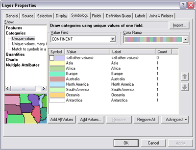
Displaying categorical data using unique symbols
Assigning unique symbols for each category can be based upon a class attribute value. A value from a series of classes or categories could be assigned to each feature. For example, roads or parcels can be drawn based upon their assigned class value (category).
A unique symbol is assigned to each categoryŚfeatures with a matching category value are drawn using an assigned symbol. For example, a color scheme may be used to assign a unique color to each attribute category as shown below. This example shows the boundaries for the continents of the world, each drawn with a different color
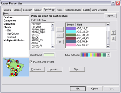
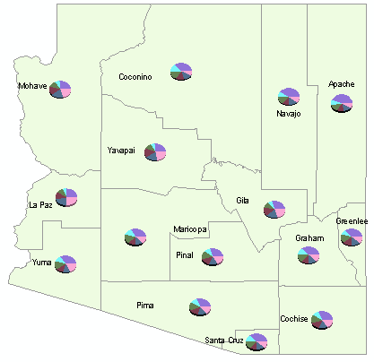
Combining quantities and categories using chart mapping
Symbolizing each feature with a chart is a way of showing categories and quantities simultaneously. You essentially create categories from related fields that contain quantities. For example, a dataset of counties might have fields for age groupsŚunder 21, 22 to 29, 30 to 39, 40 to 49, and so onŚcontaining the number of people in each group. You could use these fields as categories to create charts showing the relative number of people in each age group, for each county.
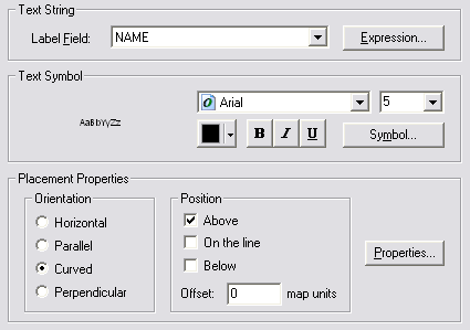
Creating text from layers
Layers are used to create map labels using attribute values. You can specify a field that can be used as the source for label text and specify a series of drawing rules for the labels. In this case, administrative boundaries will be labeled using their name, taken from the NAME field
Layers in the table of contents
The table of contents lets you specify which layers are displayed on the map (by turning them on and off). In addtion, the order of layers in the table of contents determines the drawing order of layers on the mapŚlayers higher in the table of contents are drawn on top of those lower. To change the order, click the table of contents Display tab, click and hold a layer name, and drag it up or down in the table of contents to a new position.
Layers with complete coverage of the area, such as filled polygons or a raster, are usually drawn underneath other map layers
Different types of layers
There are different kinds of layers. Some layers represent a particular type of geographic feature, while others represent a particular type of data. Each layer type has different mechanisms for displaying and symbolizing their contents, and specific operations that you will perform against them. Many layers have special sets of tools for working with the layer and its contents. For example, you can use the Editor toolbar to manipulate feature layers, the Topology toolbar to work with the contents of a topology layer, and the Annotation toolbar to create and edit annotation (text) layers.
Here are a few of the common layer types:
Feature layer: a layer that references a set of feature (vector) data that represents geographic entities as points, lines, and polygons. A feature layer''s data source can be stored in geodatabases, shapefiles, ArcInfo Coverages, CAD files, and so on.
Raster layer: a layer that references a raster or image as its data source.
Graphics layer: a layer used to display graphics, text, and annotationŚtypically on top of other map layers.
Service layer: a layer used to display ArcIMS, ArcGIS Server, WMS services, and other Web services.
Geoprocessing layer: a layer that displays the output of a geoprocessing tool.
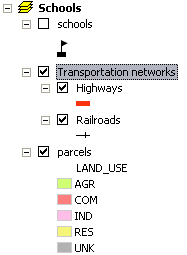
Grouping layers
Layers can be placed into group layers to combine multiple layers that are often displayed or managed together. Grouping layers can help organize related layers in a map and can be used to define advanced drawing order options. For example, suppose you have two layers on a map representing railroads and highways. You might choose to group these layers together and name the resulting layer Transportation networks (highlighted in the graphic below). When you uncheck Transportation networks in the table of contents, the Highways and Railroads sublayers are also turned off.
Common task Where to go for more information
Adding data to ArcMap
Adding layers to a map
Setting layer properties Setting layer properties
Displaying layers at certain scales
Displaying a subset of features in a layer
Referencing data with layers Repairing broken data links
Referencing data in the map
Saving a layer (.lyr file) Saving a layer to disk
Symbolizing data in a layer Drawing all features with a single symbol
Drawing features to show categories
Drawing features to show quantities
Using feature attributes to create map labels Displaying labels
Specifying the order layers draw in a map Changing a layer''s drawing order
Using the table of contents
Opening a layer''s attribute table Adding and viewing tables in ArcMap
Grouping layers Managing group layers
Relating Data About joining and relating tables
http://webhelp.esri.com/arcgisdesktop/9.2/index.cfm?TopicName=Map_Layers
HSV - Hue-Saturation-Value (lightness-Darkness)
Making maps
Map types
Symbology (next page about layers)
Multiple Classifications
Symbolizing data in a layer