 | ArcGIS for a Project |
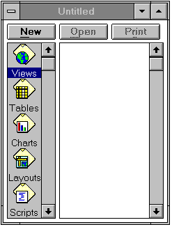
This is the main Project window, which allows you to create new Views, Charts, etc., or to open existing ones that you have already created in that project. |
Help! If you are lost and don''t know how to do something, ArcView has on-line help which is accessed by hitting the symbol in the top right corner of the display window |
Add button |
ArcView |
Paint Symbol box |
Legend Editor |
Color Palette |
zoom icon |
archive icon |
info icon |
Identify view |
table icon |
By clicking on a row in a Table you can highlight that row and the corresponding feature (evaporation station location) in the map. |
promote button |
pick button |
unselect button |
Statistics |
|
|
charted feature |
|
layout icon |
zoomtp |
|
viewlay |
chartic |
draw |
dot button |
text button |
pic.1 |
pic.2 |


ArcView is a software program, developed by Environmental Systems Research Institute (ESRI), which is used to do GIS analysis. It differs from Arc/Info in that Arc/Info is designed to develop GIS data while Arcview is designed to interact with GIS data which has already been created.
All activities within Arcview are organized with a Project, which may consist of a number of Views, Tables, Charts, Layouts and Scripts (Scripts are programs in the Avenue language and this exercise does not include user-defined scripts). The functions of Arcview include: displaying coverages in a view, viewing the related attribute tables of this view, relating attribute tables with a key item, plotting charts to display spatial information, and creating layouts of the view and related tables and charts.
Goals of the Exercise
To serve as an introduction to Arcview
To give you experience in working with Views, Tables, Charts, and Layouts in Arcview
To produce a layout on which is shown a map connected to charts of data measured at locations on the map.
Computer and Data Requirements
To carry out this exercise, you need to have access to a PC, workstation or MacIntosh system which runs Arcview, either version 3.0 or 2.1. Several of the computers in the Learning Resources Center (LRC) have ArcView 3.0 installed. You need to download the following coverages:
A polygon coverage of the counties of Texas, called Texas
A point coverage of pan evaporation gage data, called Evap
The coverages which you need to complete this exercise consist of three files each (evap.dbf, evap.shp, evap.shx and texas.dbf, texas.shp, texas.shx). For UT Austin students the files are located on the LRC NT network in the directories classmaidmentce397av2_introevap and ...av2_introtexas . They can be copied to your working directory over the network using filemanager (copy the complete folders). The files can also be downloaded using anonymous ftp from ftp.crwr.utexas.edu/pub/gisclass/ex1. See Instructions on how to use anonymous ftp for details of this procedure.
Procedure
Please Note: The following procedure is a general outline which can be followed to complete this lesson. However, the user is encouraged to experiment with the program and be creative.
1. Start Arcview
Execute ArcView on your machine. On PC''s this can be done by clicking on the Arcview Icon in the Program Manager Window.
When ArcView is first executed, a new untitled Project window is opened. This window includes several icons marked Views, Tables, Charts, Layouts, and Scripts. This is the main Project window, which allows you to create new Views, Charts, etc., or to open existing ones that you have already created in that project.
2. Display Themes in a View
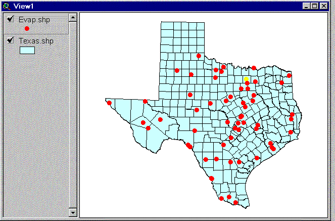
Now, be sure that the View icon is highlighted in the Project window and click on New for a new view. Drag the view window out of the way and resize it if necessary. Add a new theme to the view by clicking on the Add button on the top tool bar. Go to your local workspace directory either by typing the directory name into the pathname box or double-clicking on the directory with the mouse. Highlight the two coverages shown: Texas.shp and Evap.shp (hold the Shift key while selecting the second coverage), and click on OK to add them to your View. They will each show up as a bar in the legend portion of the View window with the name of the coverage shown on it. For the View you are working with, the coverages Evap.shp and Texas.shp are called Themes. Click on the raised box to the left of the Theme names "Texas.shp" and "Evap.shp" to make a check mark and see the coverages displayed in the View window. Drag the legend bar for the polygon coverage (Texas) below that for the point coverage (Evap) to show points on top of polygons. Dragging a theme is accomplished by clicking beside the theme symbol, holding down the mouse and dragging the box that appears.
Save the Project
The Legends for these Themes can be modified as described below. Once you''ve got your Project set up, you can save it to a file by making the Project window active and choosing the menu option File / Save Project. The Project file that you save has the extension ".apr" and contains information about the structure of your project, including the pathnames to the data dislayed in it. The Project file is an ASCII file that can be viewed with a text editor if you are curious about what it looks like. It is wise to periodically save the Project as you carry out this exercise so that you can recover all your work in the event that you crash Arcview before completing the exercise.
3. Adjust the Display of the Themes
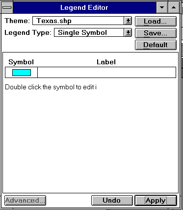
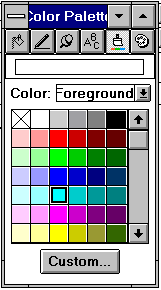
The legend for a Theme can be adjusted by double-clicking on that Theme''s name. This brings up the Legend Editor. Adjust the coloring of a theme by clicking on its Symbol box and using the paint Symbol box - paint brush in the top right corner of the Color Palette which appears. Select Apply in the Legend Editor to get the new color. Close the Color Palette and Legend Editor boxes using the icon in their upper left corner.
You can zoom in or zoom out from a portion of the View window using zoom.
To zoom to the extent of active Themes, use the archivetool in the upper row of the tool bar. A Theme is active if its legend bar in the View window appears raised.
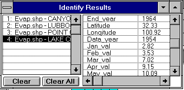
By clicking the info icon in the View tool bar and then clicking on a map feature in the View you can find out information about any feature in the active Theme (a display of its record in the data table). If you click on a feature and don''t see the correct record displayed, check to see that the correct theme is highlighted in the View window legend bar.
4. Open a Table
To View tabular information associated with a Theme, first activate the Theme of interest by clicking on the Theme name in the legend bar of the View window, then click on table in the top row of buttons to open the Table. By clicking on a row in a Table you can highlight that row and the corresponding feature (evaporation station location) in the map.
There is the correspondence between a record in the data table and a geographic feature in the map. This table-map linkage is one of the key things that makes a GIS operate effectively. To make sure that the row you''ve selected is easy to see, promote to the top of the table using the promoteicon.By holding down the shift key you can highlight several features at once.
Selecting Features Geographically in the View
Geographic features from a particular theme can be selected graphically by highlighting the theme, clicking on the pick tool, and then selecting the features in the view. Again, by holding down the shift key and you can add features to the set you''ve previously selected. You can also drag a box over a region on the screen and select all the features in that region. If you attempt to select features graphically and don''t succeed, check that you''ve clicked on the theme name in the legend bar so that it is highlighted.
By clicking on the unselect icon you can unselect all records.
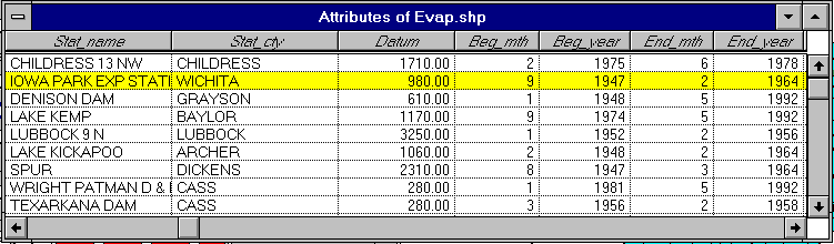
The data that you are examining are summary statistics of pan evaporation records at various sites in Texas. The attributes of the data, shown in column in the data table, include the name of the station, the city it is located nearest, the datum (elevation above mean sea level of the station in feet), the beginning and ending month and year of records, the latitude and longitude of the station in decimal degrees, and the values of the monthly and annual pan evaporation at this site in inches per month or per year, respectively.
Selecting Particular Fields in the Table
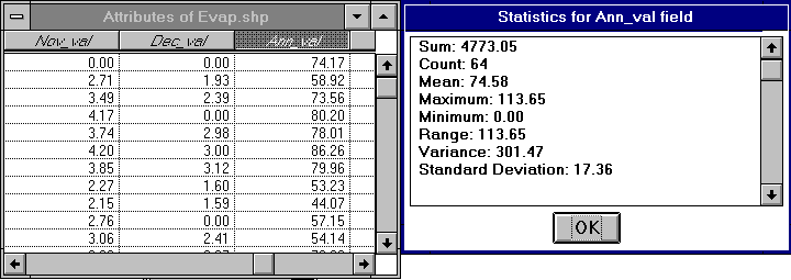
In the Table associated with Texas.shp, there are many data fields. You can see all of these fields by scrolling to the right using the scroll bar at the bottom of the Table. You can determine summary statistics for a particular field by selecting that field (depressing its header label) and then selecting Field/Statistics from the Menu Bar. If you have records selected in the table, the statistics function will summarise the statistics of these records only. If you want the statistics of all the records to be summarised, make sure that you have cleared all the selected records using the unselectbutton before calculating the statistics. 5. Make a Chart
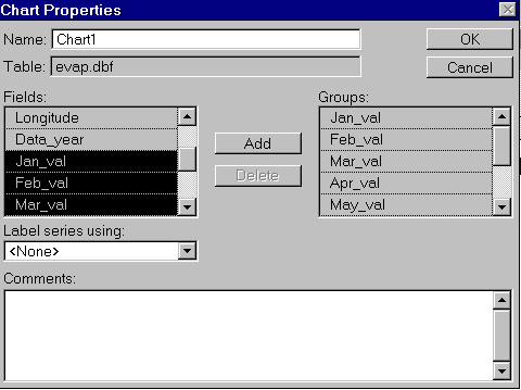
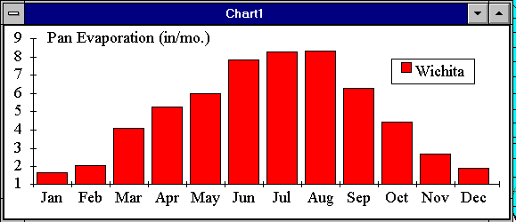
A chart can be plotted of one or more records selected from a table. Select a particular gage record by clicking on its symbol on the view or its record in the table. With the table open, click on the Chart icon in the Project window, select the items from the table to be added to the chart in the properties box and give the chart a name. For our exercise, we wish to plot the monthly evaporation, so highlight the months on the left hand side and click on the box labeled Add.
Again, multiple fields can be selected by holding down the shift key. Once this is done, click on the box labeled Add. After clicking OK, a Chart will be plotted. You can change the form of the Chart using items in the top tool bar.
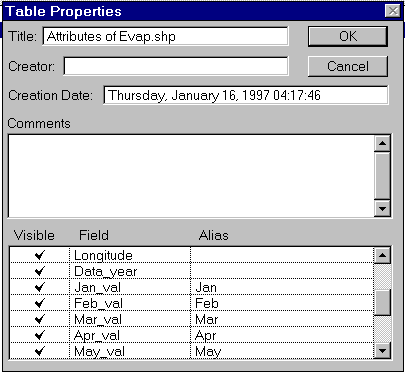
The horizontal axis of the Chart is automatically labeled using the field names you selected for plotting. If these are too long to fit on the chart, you can make shorter aliases for these field names by making the Table active, selecting the menu item Table / Properties, and entering text into the column labeled Alias. For example, you can replace the label Jan_val with Jan, etc
To Edit Features of the Chart, select the Chart Edit tool and then click on the charted feature you wish to Edit. You can change the nomenclature of the legend and the chart title and location in this way.
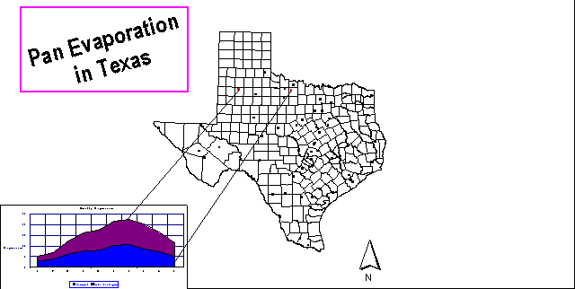
. Make a Layout
A Layout allows a user to combine Views, Tables, Charts, Legends, and Text into one document for printing. To create a new Layout, double-click on the layout icon in the Project window. To work with a Layout, it is useful to enlarge the Layout window (by dragging on the window corner(s) with the mouse). After enlarging the window, click on the Zoom to page zoomtp tool to maximize use of the window space. As illustrated in the image below, by clicking and holding the left mouse button on the furthest icon to the right on the lower tool bar, you can add a number of different objects to the Layout. From top to bottom, the objects that you can add are a View, a Legend, a Scale, a North Arrow, a Chart, a Table, or a Graphic. After selecting one of these items, you can draw a box on the Layout to specify the location and size of the selected object.
Begin by selecting a view viewlay and drawing a box to accomodate it. When you''ve drawn the box, a dialog box will come up asking you to select the view to show in the box. Select View1, and you should see your view of Texas show up.
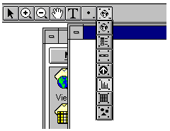
You can add another object template to the layout using the right hand side tool in the lowest row of the upper tool bar. Select the chart object chartic to add a chart. To connect the chart visually to the corresponding point in the view using the draw tool draw which is selected from the list of icons under the dot button.
You can add text to a Layout using the text button. You can also draw points, lines, and polygons using dot button. If you find that the lines you are drawing are not in quite the right locations, use Layout/Properties and click off the "Snap to Grid" box. To change the size of the text you''ve added, highlight the text and use Window/Show Symbol Palette and the text icon to alter the text size. Text size of 14 point is the default. Usually 24 or 36 point looks good in layouts. Similarly, to change the line thickness use the same pallete and select the Line icon. Line thickness of 1 is the default.
7. Do Something Creative!!
Now that you are familiar with the operation of Arcview, make some new maps, charts or tables of different variables in places that are of interest to you.
8.To be Turned In
A copy of your layout showing the map of Texas and display of evaporation pan data in some form.
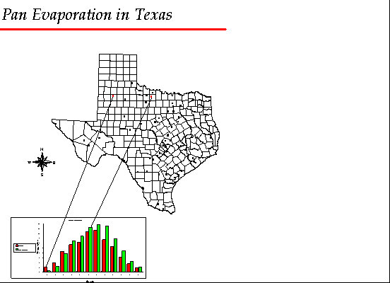
Some example layouts produced by previous students in this course are shown pic.1-2
Capturing and Displaying Screen Images
Introduction to ArcView