 | Analysis: Data Structure |
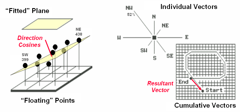
Figure 5.5-3. Best-Fitted Plane and Vector Algebra can be used to calculate overall slope |
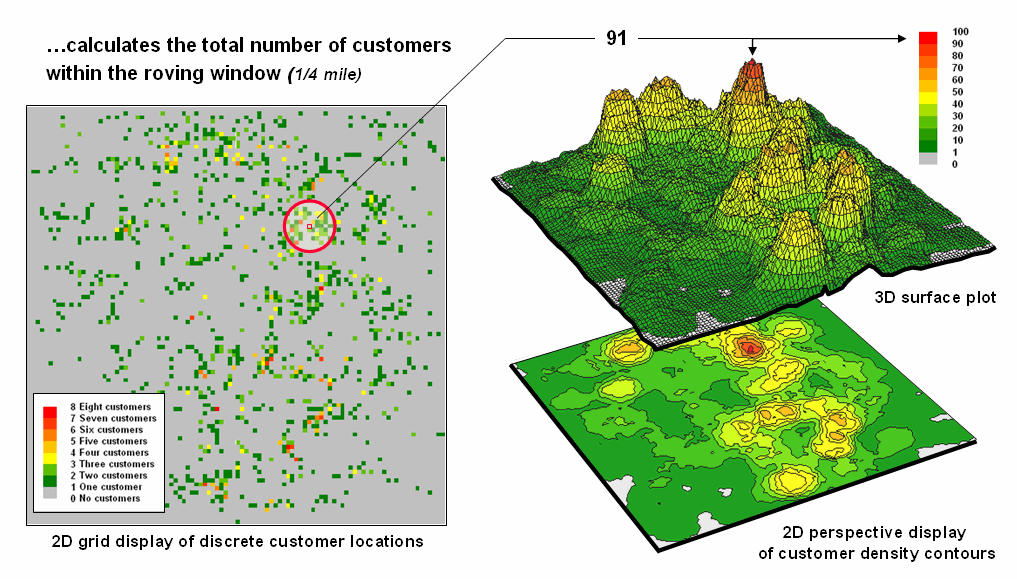
Figure 5.5-4 Approach used in deriving a Customer Density surface from a map of customer locations |
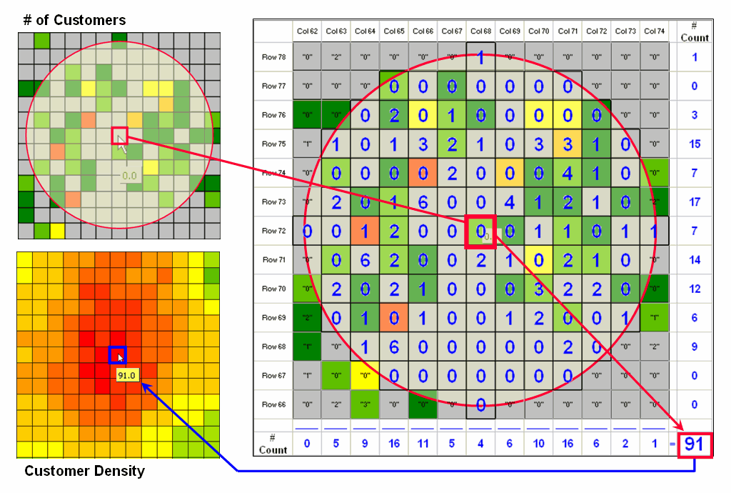
Figure 5.5-5. Calculations involved in deriving customer density. |
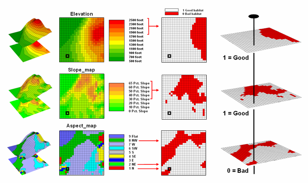
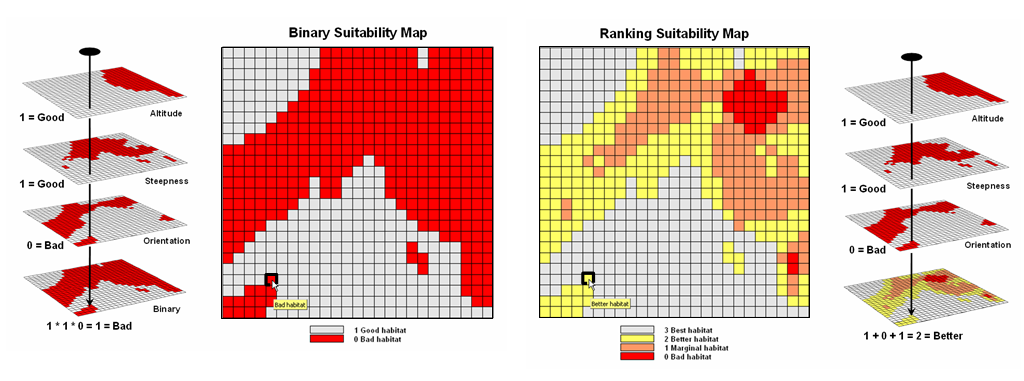
Figure 6.1-1. Binary maps representing Hugag habitat preferences are coded as 1= good and 0= bad. |
Figure 6.1.2-1. The binary habitat maps are multiplied together to create a Binary Suitability map (good or bad) or added together to create a Ranking Suitability map (bad, marginal, better or best). |
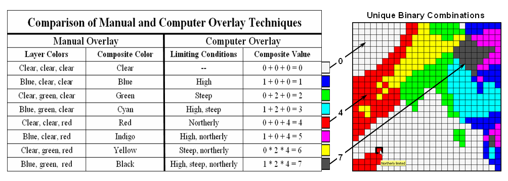
Figure 6.1.2-2. The sum of a binary progression of values on individual map layers results in a unique value for each combination |
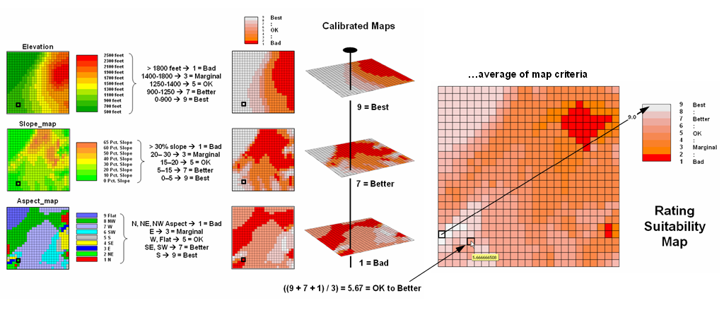
Figure 6.1.3-1. A Rating Suitability map is derived by averaging a series of ōgradedö maps representing individual habitat criteria |
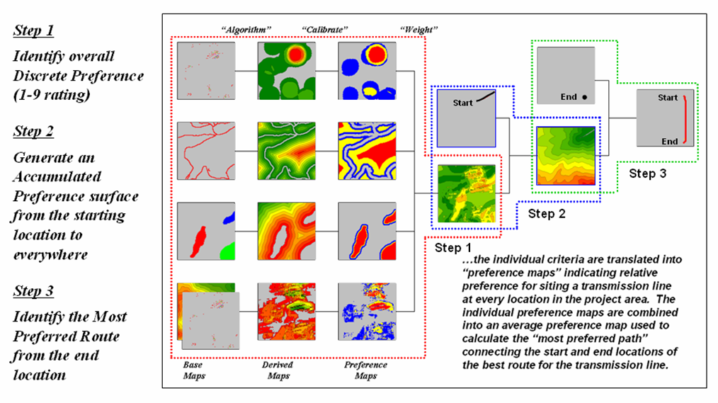
Figure 6.2.1-1. GIS-based routing uses three steps to establish a discrete map of the relative preference for siting at each location, generate an accumulated preference surface from a starting location(s) and derive the optimal route from an end point as the path of least resistance guided by the surface |
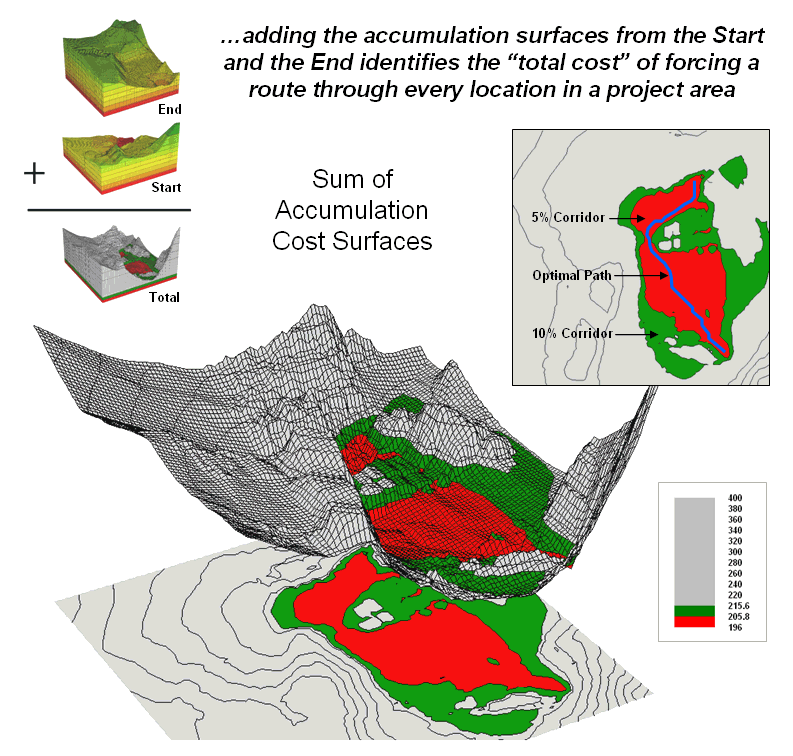
Figure 6.2.2-1. The sum of accumulated surfaces is used to identify siting corridors as low points on the total accumulated surface |
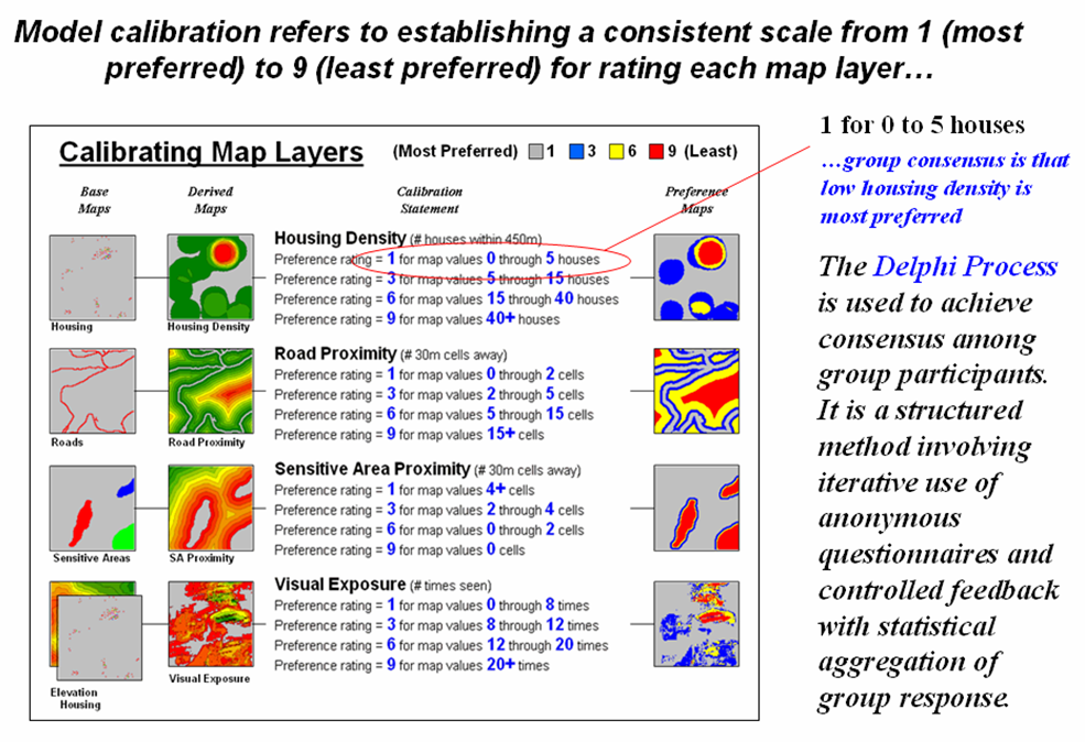
Figure 6.2.3-1. The Delphi Process uses structured group interaction to establish a consistent rating for each map layer |
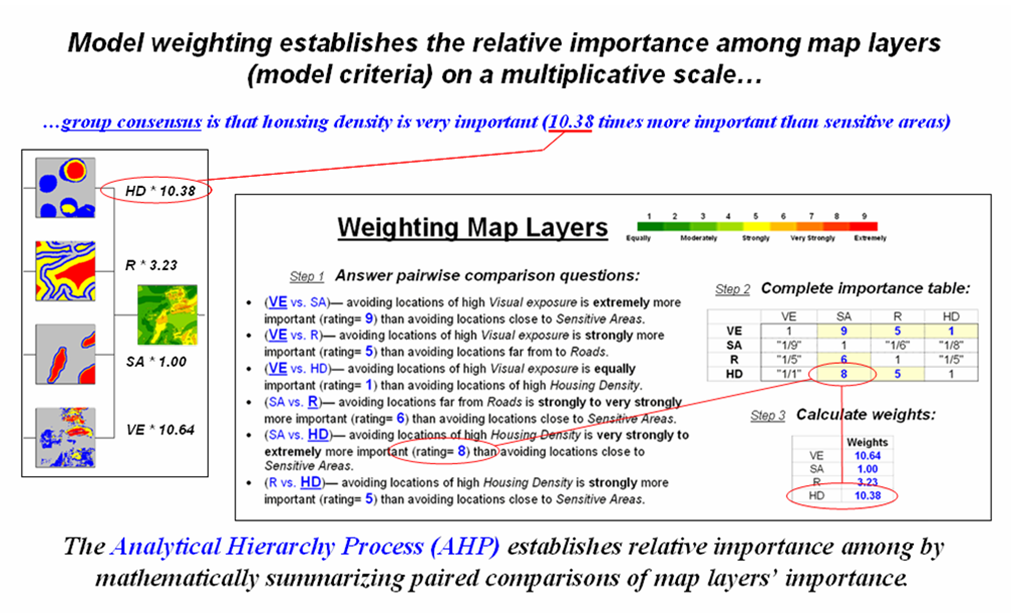
Figure 6.2.4-1. The Analytical Hierarchy Process uses direct comparison of map layers to derive their relative importance. |
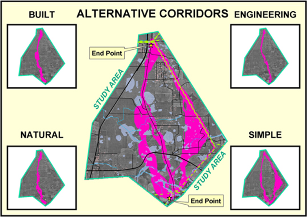
Figure 6.2.5-1. Alternate routes are generated by evaluating the model using weights derived from different group perspectives. (Courtesy of Photo Science and Georgia Transmission Corporation) |
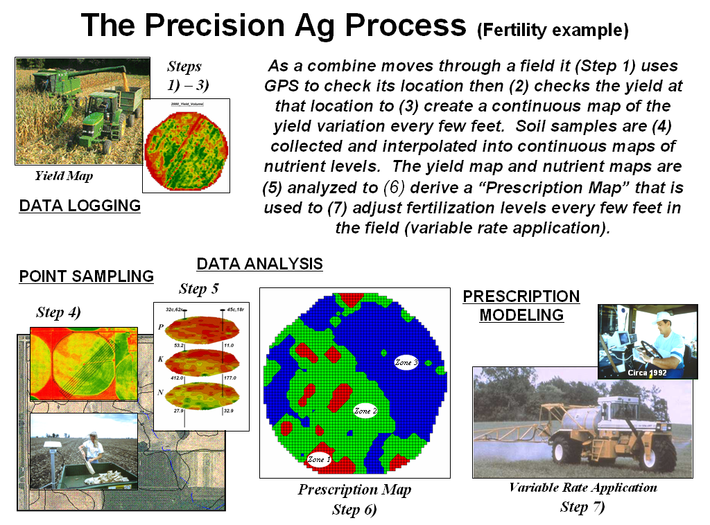
Figure 6.3.1-1. The Precision Agriculture process analysis involves Data Logging, Point Sampling, Data Analysis and Prescription Mapping. |
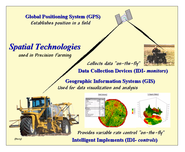
Figure 6.3.2-1. Precision Agriculture involves applying emerging spatial technologies of GPS, GIS and IDI |
Data Structure Implications
Points, lines and polygons have long been used to depict map features. With the stroke of a pen a cartographer could outline a continent, delineate a road or identify a specific buildingÆs location. With the advent of the computer, manual drafting of these data has been replaced by stored coordinates and the cold steel of the plotter.
In digital form these spatial data have been linked to attribute tables that describe characteristics and conditions of the map features. Desktop mapping exploits this linkage to provide tremendously useful database management procedures, such as address matching and driving directions from you house to a store along an organized set of city street line segments. Vector-based data forms the foundation of these processing techniques and directly builds on our historical perspective of maps and map analysis.
Grid-based data, on the other hand, is a relatively new way to describe geographic space and its relationships. At the heart of this digital format is a new map feature that extends traditional points, lines and polygons (discrete objects) to continuous map surfaces.
The rolling hills and valleys in our everyday world is a good example of a geographic surface. The elevation values constantly change as you move from one place to another forming a continuous spatial gradient. The left-side of figure 3.0-1 shows the grid data structure and a sub-set of values used to depict the terrain surface shown on the right-side. Note that the shaded zones ignore the subtle elevation differences within the contour polygons (vector representation).
Grid data are stored as a continuous organized set of values in a matrix that is geo-registered over the terrain. Each grid cell identifies a specific location and contains a map value representing its average elevation. For example, the grid cell in the lower-right corner of the map is 1800 feet above sea level (falling within the 1700 to 1900 contour interval). The relative heights of surrounding elevation values characterize the subtle changes of the undulating terrain of the area.
3.1 Grid Data Organization
Map features in a vector-based mapping system identify discrete, irregular spatial objects with sharp abrupt boundaries. Other data typesŚraster images and raster gridsŚtreat space in entirely different manner forming a spatially continuous data structure.
For example, a raster image is composed of thousands of æpixelsÆ (picture elements) that are analogous to the dots on a computer screen. In a geo-registered B&W aerial photo, the dots are assigned a grayscale color from black (no reflected light) to white (lots of reflected light). The eye interprets the patterns of gray as forming the forests, fields, buildings and roads of the actual landscape. While raster maps contain tremendous amounts of information that are easily ōseenö and computer classified using remote sensing software, the data values reference color codes reflecting electromagnetic response that are too limited to support the full suite of map analysis operations involving relationships within and among maps.
Raster grids, on the other hand, contain a robust range of values and organizational structure amenable to map analysis and modeling. As depicted on the left side of figure 3.1-1, this organization enables the computer to identify any or all of the data for a particular location by simply accessing the values for a given column/row position (spatial coincidence used in point-by-point overlay operations). Similarly, the immediate or extended neighborhood around a point can be readily accessed by selecting the values at neighboring column/row positions (zonal groupings used in region-wide overlay operations). The relative proximity of one location to any other location is calculated by considering the respective column/row positions of two or more locations (proximal relationships used in distance and connectivity operations).
There are two fundamental approaches in storing grid-based dataŚindividual ōflatö files and ōmultiple-gridö tables (right side of figure 3.1-1). Flat files store map values as one long list, most often starting with the upper-left cell, then sequenced left to right along rows ordered from top to bottom. Multi-grid tables have a similar ordering of values but contain the data for many maps as separate field in a single table.
Generally speaking the flat file organization is best for applications that create and delete a lot of maps during processing as table maintenance can affect performance. However, a multi-gird table structure has inherent efficiencies useful in relatively non-dynamic applications. In either case, the implicit ordering of the grid cells over continuous geographic space provides the topological structure required for advanced map analysis.
3.2 Grid Data Types
Understanding that a digital map is first and foremost an organized set of numbers is fundamental to analyzing mapped data. The location of map features are translated into computer form as organized sets of X,Y coordinates (vector) or grid cells (raster). Considerable attention is given data structure considerations and their relative advantages in storage efficiency and system performance.
However this geo-centric view rarely explains the full nature of digital maps. For example, consider the numbers themselves that comprise the X,Y coordinatesŚhow does number type and size effect precision? A general feel for the precision ingrained in a ōsingle precision floating pointö representation of Latitude/Longitude in decimal degrees isŚ
1.31477E+08 ft = equatorial circumference of the earth
1.31477E+08 ft / 360 degrees = 365214 ft per degree of Longitude
A single precision number carries six decimal places, soŚ
365214 ft/degree * 0.000001= .365214 ft *12 = 4.38257 inch precision
In analyzing mapped data however, the characteristics of the attribute values are just as critical as precision in positioning. While textual descriptions can be stored with map features they can only be used in geo-query. Figure 3.2-1 lists the data types by two important categoriesŚnumeric and geographic. Nominal numbers do not imply ordering. A value of 3 isnÆt bigger, tastier or smellier than a 1, it is just not a 1. In the figure these data are schematically represented as scattered and independent pieces of wood.
Ordinal numbers, on the other hand, imply a definite ordering and can be conceptualized as a ladder, however with varying spaces between rungs. The numbers form a progression, such as smallest to largest, but there isnÆt a consistent step. For example you might rank different five different soil types by their relative crop productivity (1= worst to 5= best) but it doesnÆt mean that soil type 5 is exactly five times more productive than soil type 1.
When a constant step is applied, Interval numbers result. For example, a 60o Fahrenheit spring day is consistently/incrementally warmer than a 30o winter day. In this case one ōdegreeö forms a consistent reference step analogous to typical ladder with uniform spacing between rungs.
A ratio number introduces yet another conditionŚan absolute referenceŚthat is analogous to a consistent footing or starting point for the ladder, analogous to zero degrees Kelvin temperature scale that defines when all molecular movement ceases. A final type of numeric data is termed Binary. In this instance the value range is constrained to just two states, such as forested/non-forested or suitable/not-suitable.
So what does all of this have to do with analyzing digital maps? The type of number dictates the variety of analytical procedures that can be applied. Nominal data, for example, do not support direct mathematical or statistical analysis. Ordinal data support only a limited set of statistical procedures, such as maximum and minimum. These two data types are often referred to as Qualitative Data. Interval and ratio data, on the other hand, support a full set mathematics and statistics and are considered Quantitative Data. Binary maps support special mathematical operators, such as .AND. and .OR.
The geographic characteristics of the numbers are less familiar. From this perspective there are two types of numbers. Choropleth numbers form sharp and unpredictable boundaries in space such as the values on a road or cover type map. Isopleth numbers, on the other hand, form continuous and often predictable gradients in geographic space, such as the values on an elevation or temperature surface.
Figure 3.2-2 puts it all together. Discrete maps identify mapped data with independent numbers (nominal) forming sharp abrupt boundaries (choropleth), such as a cover type map. Continuous maps contain a range of values (ratio) that form spatial gradients (isopleth), such as an elevation surface.
The clean dichotomy of discrete/continuous is muddled by cross-over data such as speed limits (ratio) assigned to the features on a road map (choropleth). Understanding the data type, both numerical and geographic, is critical to applying appropriate analytical procedures and construction of sound GIS models.
3.3 Grid Data Display
Two basic approaches can be used to display grid dataŚ grid and lattice. The Grid display form uses cells to convey surface configuration. The 2D version simply fills each cell with the contour interval color, while the 3D version pushes up each cell to its relative height. The Lattice display form uses lines to convey surface configuration. The contour lines in the 2D version identify the breakpoints for equal intervals of increasing elevation. In the 3D version the intersections of the lines are ōpushed-upö to the relative height of the elevation value stored for each location.
Figure 3.3-1 shows how 3D plots are generated. Placing the viewpoint at different look-angles and distances creates different perspectives of the reference frame. For a 3D grid display entire cells are pushed to the relative height of their map values. The grid cells retain their projected shape forming blocky extruded columns. The 3D lattice display pushes up each intersection node to its relative height. In doing so the four lines connected to it are stretched proportionally. The result is a smooth wire-frame that expands and contracts with the rolling hills and valleys.
Generally speaking, lattice displays create more pleasing maps and knock-your-socks-off graphics when you spin and twist the plots. However, grid displays provide a more honest picture of the underlying mapped dataŚa chunky matrix of stored values. In either case, one must recognize that a 3-D display is not the sole province of elevation data. Often a 3-dimensional plot of data such as effective proximity is extremely useful in understanding the subtle differences in distances.
3.4 Visualizing Grid Values
In a GIS, map display is controlled by a set of user-defined toolsŚnot the cartographer/publisher team that produced hardcopy maps just a couple of decades ago. The upside is a tremendous amount of flexibility in customizing map display (potential for tailoring). The downside is a tremendous amount of flexibility in customizing map display (potential for abuse).
The display tools are both a boon and a bane as they require minimal skills to use but considerable thought and experience to use correctly. The interplay among map projection, scale, resolution, shading and symbols can dramatically change a mapÆs appearance and thereby the information it graphically conveys to the viewer.
While this is true for the points, lines and areas comprising traditional maps, the potential for cartographic effects are even more pronounced for contour maps of surface data. For example, consider the mapped data of animal activity levels from 0.0 to 85.2 animals in a 24-hour period shown in figure 3.4-1. The map on the left uses an Equal Ranges display with contours derived by dividing the data range into nine equal steps. The flat area at the foot of the hill skews the data distribution toward lower values. The result is significantly more map locations contained in the lower contour intervalsŚ first interval from 0 to 9.5 = 39% of the map area. The spatial effect is portrayed by the radically different areal extent of the contours.
The middle map in the figure shows the same data displayed as Equal Counts with contours that divide the data range into intervals that represent equal amounts of the total map area. Notice the unequal spacing of the breakpoints in the data range but the balanced area of the color bandsŚthe opposite effect as equal ranges.
The map on the right depicts yet another procedure for assigning contour breaks. This approach divides the data into groups based on the calculated mean and Standard Deviation. The standard deviation is added to the mean to identify the breakpoint for the upper contour interval and subtracted to set the lower interval. In this case, the lower breakpoint calculated is below the actual minimum so no values are assigned to the first interval (highly skewed data). In statistical terms the low and high contours are termed the ōtailsö of the distribution and locate data values that are outside the bulk of the dataŚ identifying ōunusuallyö lower and higher values than you normally might expect. The other five contour intervals in the middle are formed by equal ranges within the lower and upper contours. The result is a map display that highlights areas of unusually low and high values and shows the bulk of the data as gradient of increasing values.
The bottom line of visual analysis is that the same surface data generated dramatically different map products. All three displays contain nine intervals but the methods of assigning the breakpoints to the contours employ radically different approaches that generate fundamentally different map displays.
So which display is correct? Actually all three displays are proper, they just reflect different perspectives of the same data distributionŚa bit of the art in the art and science of GIS. The translation of continuous geographic data into discrete 2D maps invariably conjures up artful interpretation. A good rule of thumb is to be skeptical of the lines on any map that portrays continuous phenomena, such as elevation, proximity, buffers, density, visual exposure or activity. Visualizing and analyzing these data are usually best when the full information content of map surfaces is employed.